@media query is a good way to alter the layout as well as UI of a website, but using too many @media queries is not a good practice when it comes to maintenance. Instead, you can use clamp() to achieve the same result with more lightweight and maintainable stylesheets. Here are some practical ways to use clamp() instead of @media query.
Fluid Padding
Let’s say you have a container width padding: 50px on Desktop and padding: 50px 20px when on Mobile. Traditionally, you can do this with @media query, as follows:
.container {
  padding: 50px;

  @media (max-width: 768px) {
    padding: 50px 20px;
  }
}
Code language: CSS (css)
But with clamp(), you only need this:
.container {
  padding: 50px clamp(20px, calc((100vw - 768px) * 9999), 50px);
}
Code language: CSS (css)
This is how it works:
- You’re probably know what
clamp()is. It has three parameters:minimum,preferred,maximumvalues.clamp()always use thepreferredvalue for the property, in this case,padding. Usually, this value is set dynamically to achieve fluidity. But it’s not allowed to go higher themaximumvalue or lower theminimumvalue. Otherwise, it will use those values.
- In this setup, we use
calc((100vw - 768px) * 9999)as a toggle rather than a true value. It has two scenarios:- When viewport is larger than 768px (Desktop):
(100vw - 768px)becomes a positive number, after multiply by9999, it becomes a massive positive number, which is larger than50px. So it will choose50pxfor thepaddingproperty. - When viewport is smaller than 768px (Mobile):
(100vw - 768px)becomes a negative number, after multiply by9999, it becomes a massive negative number, which is smaller than20px. So it will choose20pxfor thepaddingproperty.
- When viewport is larger than 768px (Desktop):
The whole expression seems complex at first but then becomes easy to memorize after some practices.
Sticky Sidebar
Context: You have a two-column layout, you want the left column (sidebar) to be sticky at 50px top but two columns will stack on Mobile, with left column is not sticky anymore.
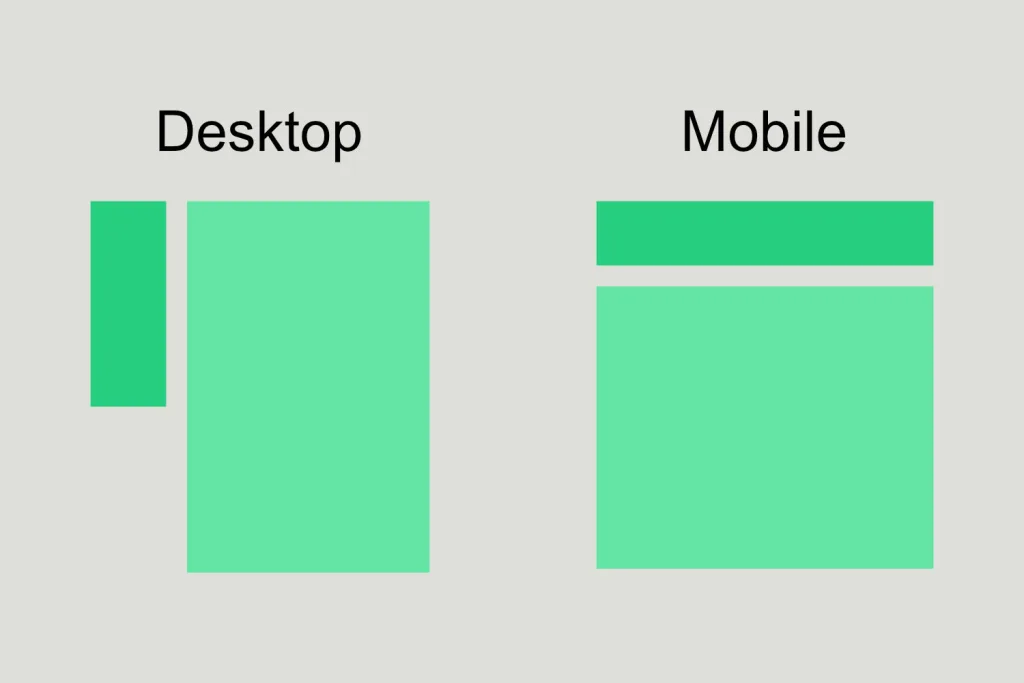
Using @media query:
@media (min-width: 768px) {
  .left-column {
    position: sticky;
    top: 50px;
  }
}
Code language: CSS (css)
Using clamp():
.left-column {
  position: sticky;
  top: clamp(-9999px, (100vw - 768px) * 9999, 50px);
}
Code language: CSS (css)
The clamp() setup is more cleaner and straightforward.
This is how it works: The expression (100vw - 768px) * 9999 acts as a toggle based on the viewport width:
- When viewport is larger than 768px (Desktop):
100vw - 768pxresults in a negative number. Multiplying this by9999creates a massive negative value (e.g.,-200000px). Theclamp()function compares this against the minimum value (-9999px) and chooses-9999px.- Because
top: -9999pxis active and it’s at a much higher positon then the top of the screen (it still sticky but attop: -9999px), the column appears to not sticky, visually.
- Because
- When viewport is smaller than 768px (Mobile):
100vw - 768pxresults in a positive number. Multiplying this by9999creates a massive positive value. Theclamp()function caps this at your defined maximum value:50px. The left column now sticky exactly attop: 50px.
Fluid Typography
When building a responsive website, you may want the font-size to scale responsively from Desktop to Mobile and vice versa. The old and non-fluid way to achieve this with @media query is:
h1 { font-size: 4rem; }

@media (max-width: 1024px) { h1 { font-size: 3rem; } }
@media (max-width: 768px)  { h1 { font-size: 2rem; } }
Code language: CSS (css)
The modern and fluid way:
h1 { font-size: clamp(2rem, 1rem + 4vw, 4rem); }
Code language: CSS (css)
In the old way, your font-size doesn’t scale all the time. It instantly jumps from 4rem to 3rem and then to 2rem. In the modern way, your font-size actually scales with the browser viewport. You can drag and change the browser’s width to see its scale effect.
Next time, when you’re thinking about breakpoint or about to use @media query, just think again if you can use an alternative like clamp(). It may saves you a lot of CSS lines as well as effort to maintain the whole styling system.